

Summer by the Lake – 2024 Online and Offline Campaign for LUPA
A fresh look and seasonal messaging for Hungary’s favorite urban beach.
The Project and the Challenge
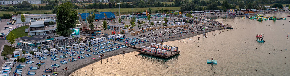
This was a summer project aimed at giving LUPA a fresh new look and a seasonal campaign for 2024. Compared to previous years, LUPA wanted to reposition itself as a family-friendly and lovable beach destination — a place where the whole family can enjoy a day out together.
The campaign, which covered the entire 2024 summer season, included a full website redesign, planning of the social media campaign, as well as the design and unification of printed materials and on-site signage — such as directional signs, ticket information, and door stickers.
While the LUPA logo was also refreshed during this period, its redesign was not part of this project.
The planing
The design phase was a highly complex process, preceded by a thorough analysis.
We had to take into account both online and offline appearances, assess competitors, and identify the key elements needed to engage a new target audience.
From the previous visual identity, only LUPA’s signature cyan color remained — every other element was reimagined and transformed.
Design steps
The design process

01
Board
design
The work began with exploring the identity and mood of similar international beach destinations.
I studied several websites and design styles — here are a few examples that served as inspiration.


02
Competitor Analysis
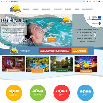
Next, I examined who the competitors of LUPA Lake are, identifying the actual rivals and analyzing what kind of websites and communication they use.
LUPA Lake offers unique swimming and sports opportunities alongside the summer beaches and lakes around Budapest.
03
Current website analysis
The dominant color on the LUPA website was LUPA’s cyan green, which was the only element to be retained on the site.
There are four main pillars:
-
Gastronomy
-
Family
-
Sport
-
Events
Each submenu had a different subpage, each with its own colors and graphics. These definitely needed to be simplified and unified, and the client agreed with this approach


04
Colors
online
Creating the color palette is a very important task in both a campaign and a website design.
Initially, I based it on the previously created moodboard, which helped determine the colors that could appear alongside Lupa’s cyan shade. After analyzing the website, I was sure that four primary colors would be needed to represent Lupa’s four main pillars, and that these colors would look great on a stylized cyan background.
(The colors of the concept were later changed at the client’s request.)
Backgrounds
The background graphics were inspired by water elements, envisioning a visual style similar to the examples shown here.
The LUPA branding will be highlighted through the use of its four core colors integrated into these backgrounds.


05
Idea,
concept
I like it when the client doesn’t just encounter one idea, especially if the task offers multiple alternatives.
So, for this project, I started with several concepts, and in the end, I presented two concepts to the client. Both had similar wording but were realized in quite different ways.
Ultimately, the client preferred the “Summer at the Lake” concept out of the two.
Summer by the Lake
This slogan became the driving force, with its strength lying in placing the lake as the most important summer destination at the center — which is also highlighted by the designed graphics.
The main element is a prominent circle, the focal point, from which key elements always “protrude” (the negative form of this is also allowed). In the background, either the lake itself or a stylized backdrop of it is featured.
The four base colors appearing in the images represent Lupa’s four main pillars: sport, gastronomy, family, and events as the highlighted content.


Magical Summer by the Lake
The other concept started with the slogan "Magical Summer by the Lake," where the world of doodles was brought into Lupa’s everyday life, inviting visitors to a magical, playful adventure. This approach specifically targeted families with children as a new audience.
06
Website
redesign
The website layout was already fixed, so my task was the graphic redesign. (Uploading images was not part of my work.)
In addition to the complete overhaul of the homepage, I also had to design the tiles for the subpages.
An important element was the 4 main pillars:
-
gastronomy
-
family
-
sport
-
events
(During the project, the gastronomy tile was replaced with a locations tile.)


Subpages
The images on the subpages were each given a mask, behind which the content was uploaded by the website operator.
07
Socail design basics
For me, it’s important that once a well-designed look is created, it works well across all sizes and platforms.
For each weekly theme, basic Facebook and Instagram images were needed.

08
Production of Offline Materials
After completing the online materials, the offline tasks followed.
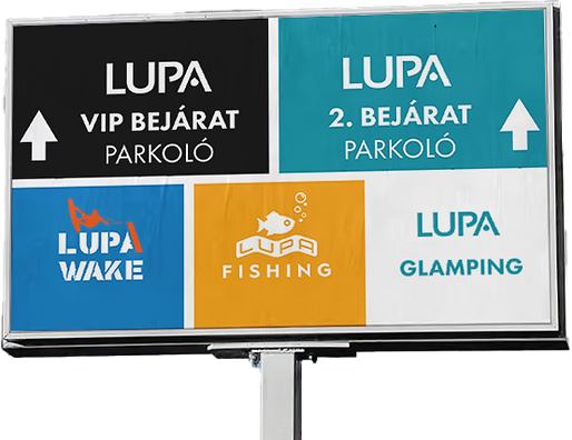
When designing the on-site directional signs, the use of distinctive colors was the main focus.
In addition to creating the graphics, preparing the files for printing was also part of the task.
Door Stickers
It was also necessary to create stickers for the doors on site—cash desk, first aid, restrooms—all received a unified design.


Summary
Planning and Executing the "Summer by the Lake" Campaign for Lupa
Designing and executing the "Summer by the Lake" campaign for Lupa was a refreshing summer experience for me. First, I created a campaign plan, and based on that, I produced all the necessary elements for the website and the lake itself.
In addition to the website and on-site signage, during the summer season I created social media materials for 4-5 weekly programs and also designed related offline advertisements.


